
Lists, tables and settings got a cleaner look across the app: search and filters sit in the same box as the results, rows are easier to scan, and the text is the same size on every page.
Lists
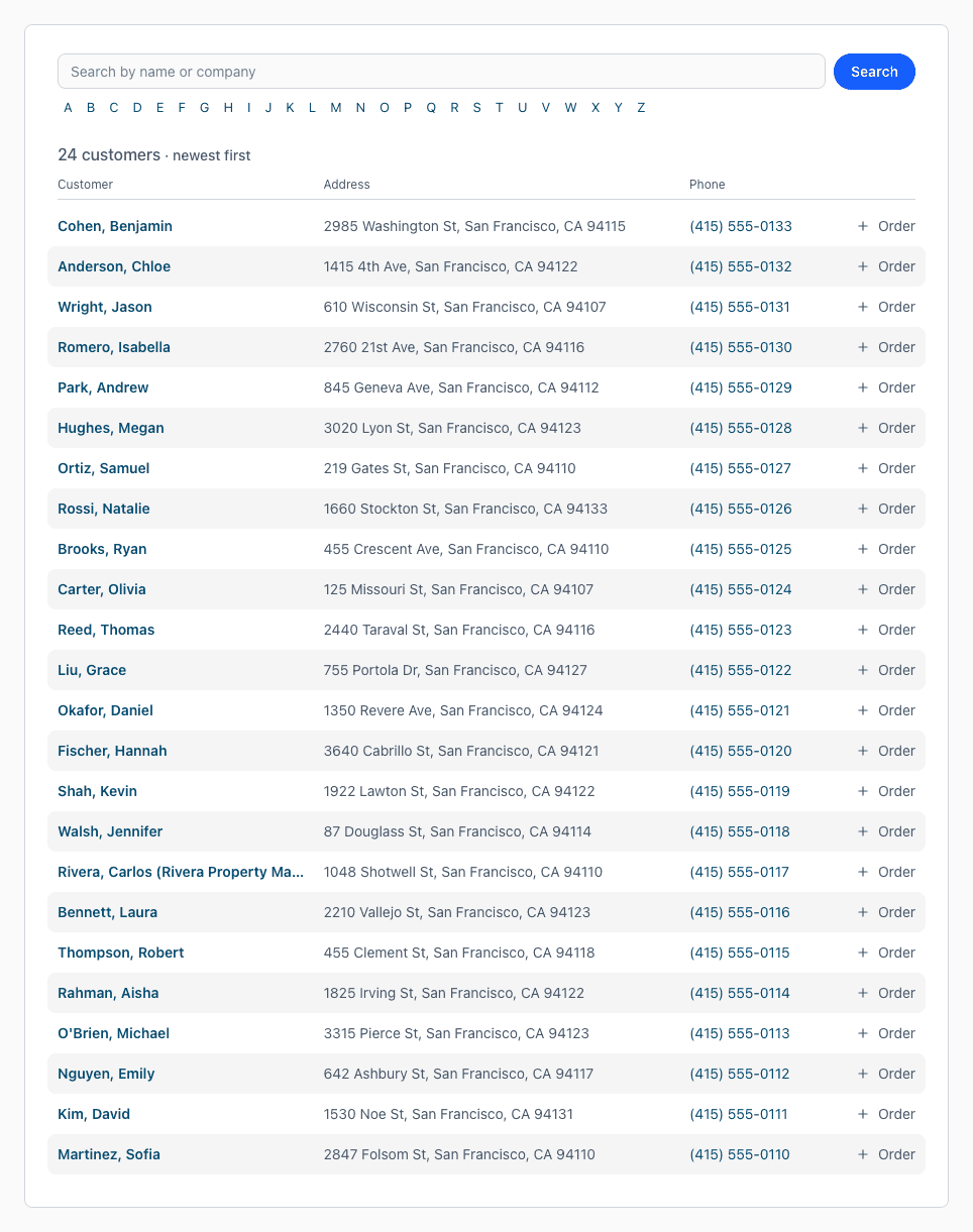
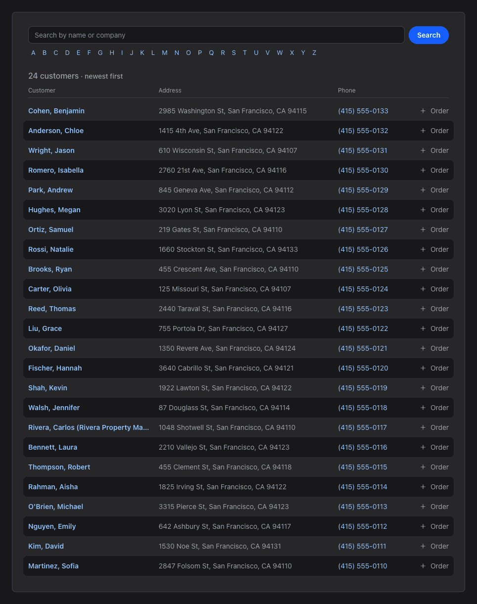
- Customers, Contacts and Search show the search box, the letters and the results together. Click anywhere on a row to open it.
- Customers now shows each customer's phone number, and Order on a row starts a new order for that customer.
- Contacts has a Type menu next to the count to show only one type of contact.
- Search results show each order's status. The results per page menu and sorting by column are gone; results are always newest first.
- Use j and k to move through the rows of these lists and Enter to open one.
Tables and Reports
- Every table, from the orders list to reports, has lighter headings and striped rows.
- The lists under Settings (users, groups, invoice items, order statuses, contact types and custom fields) and every report keep the form and the list in one box.
- When you click a name to change it, the box is wide enough to show the whole name.
Settings
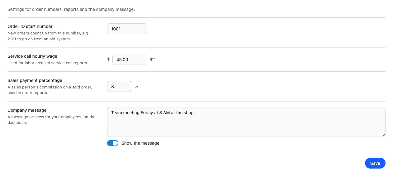
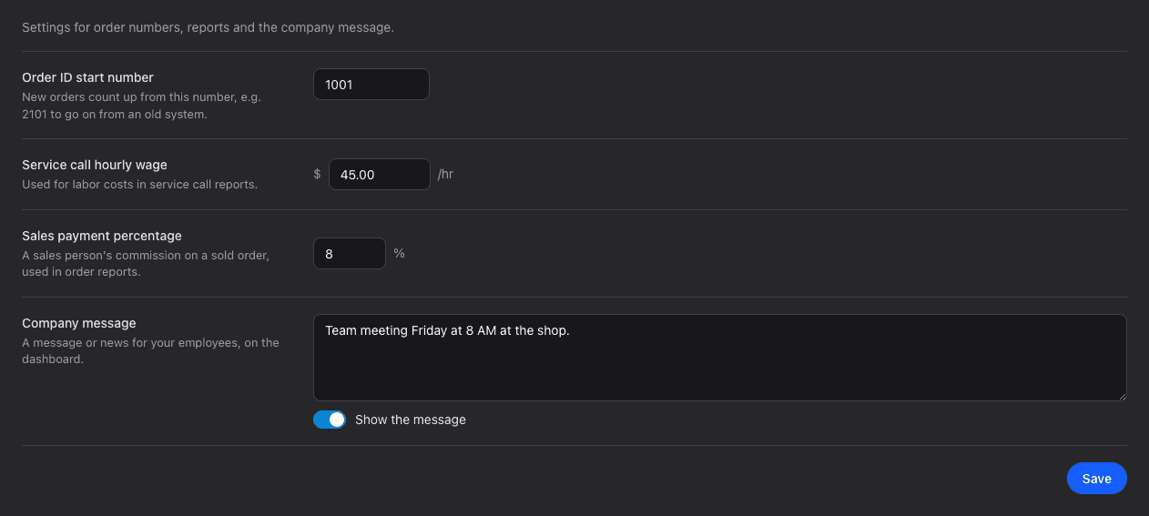
Settings > Application and Templates explain each setting next to it, so there's no need to hover for help. The company message has a Show the message switch.
Fixes
- Tapping a phone number with an extension now calls the main number.
- Improved security.
Have a question or feedback about these changes? Send us a note.